Branding Story

The objective of this visual identity package is to set the parameters of the utilization of the new brand elements. The new visual identity brings a modern, high end approach to the brand which will resonate with the target market, shifting BHC Group to a high level of perception.

Case Information

  • My Role

    Brand Design, UI Design, Mobile UI Design, Visual Design, Interaction Design, Branding Guideline

  • Tools & Method

    Adobe Illustrator, Figma, Adobe Photoshop ​

  • Client

    Y5 Creative

Logo​

The logo incorporates the letters B, C and negative H, while the hexagonal shape represents the company's vision of work, reliability, accountability, communication, and knowledge.

Colour Palette

The colours are chosen in order to project the branding image of a high-end, customer-oriented, friendly, knowledgeable and trusted company.

Typography

Typography is a powerful branding tool when used consistently. The typeface laid out pairs best with the brand and provides it with a modern elegance.

Guideline

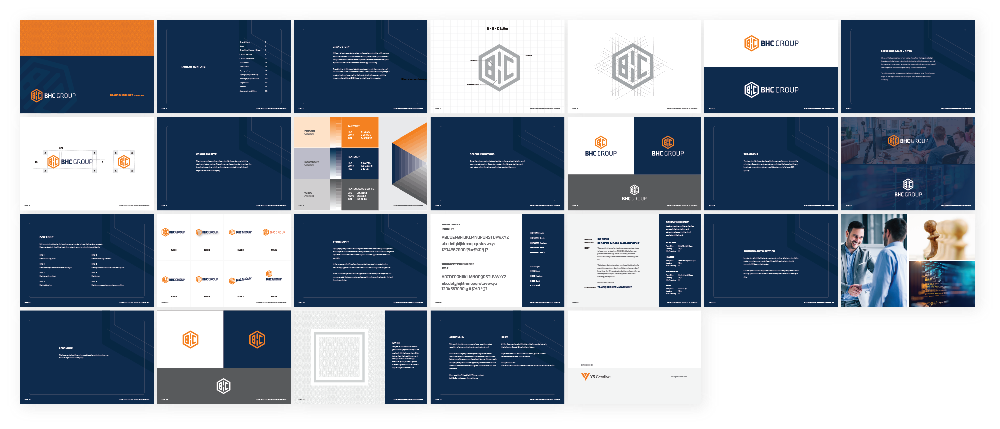
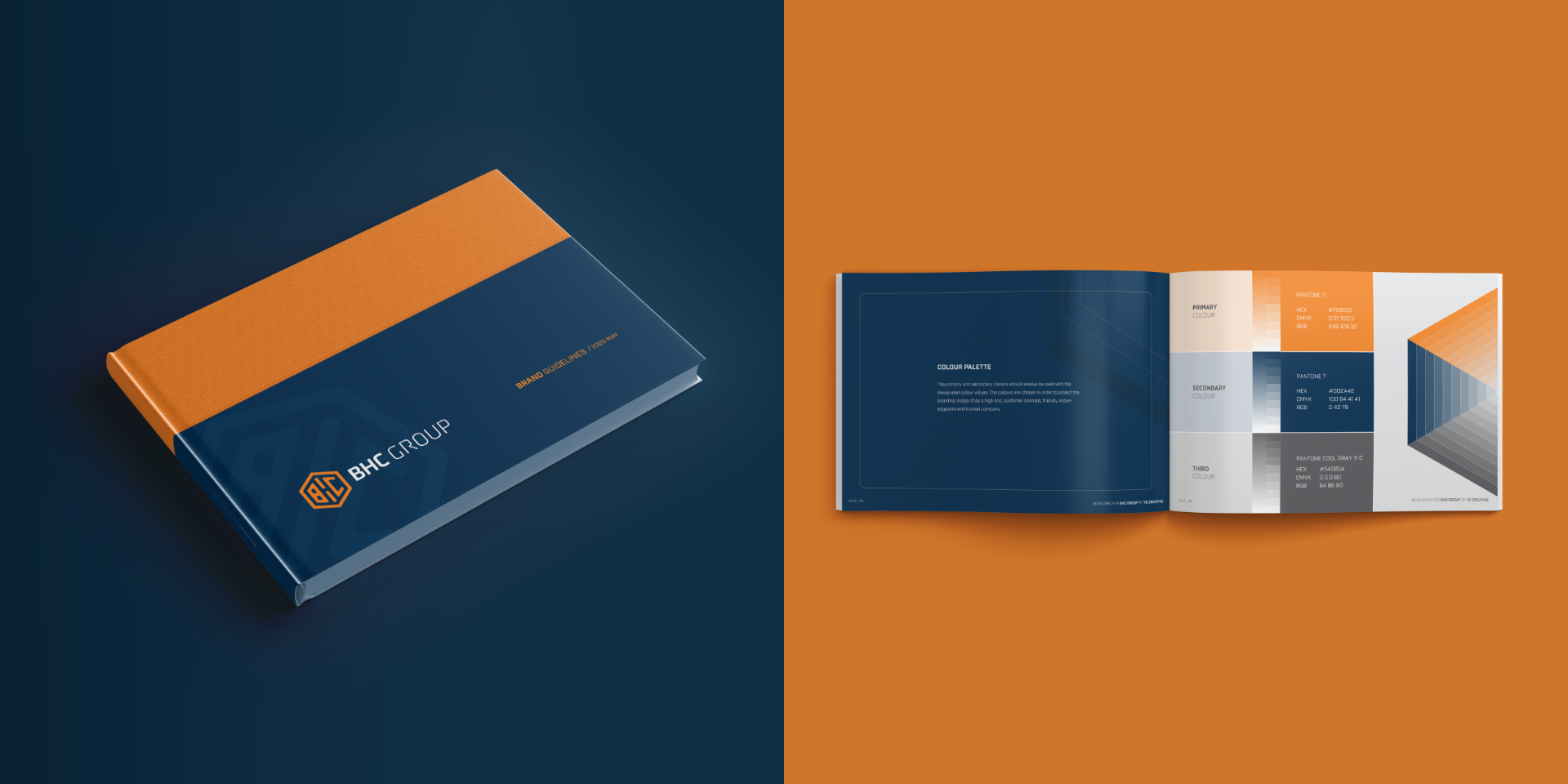
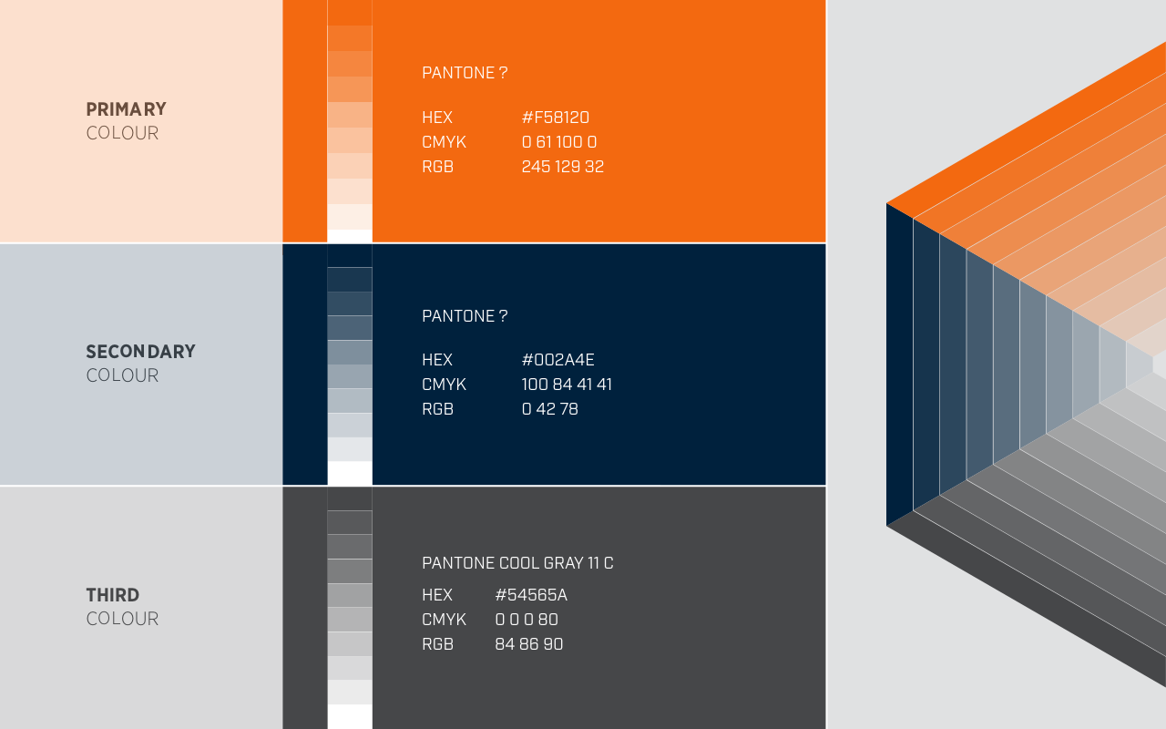
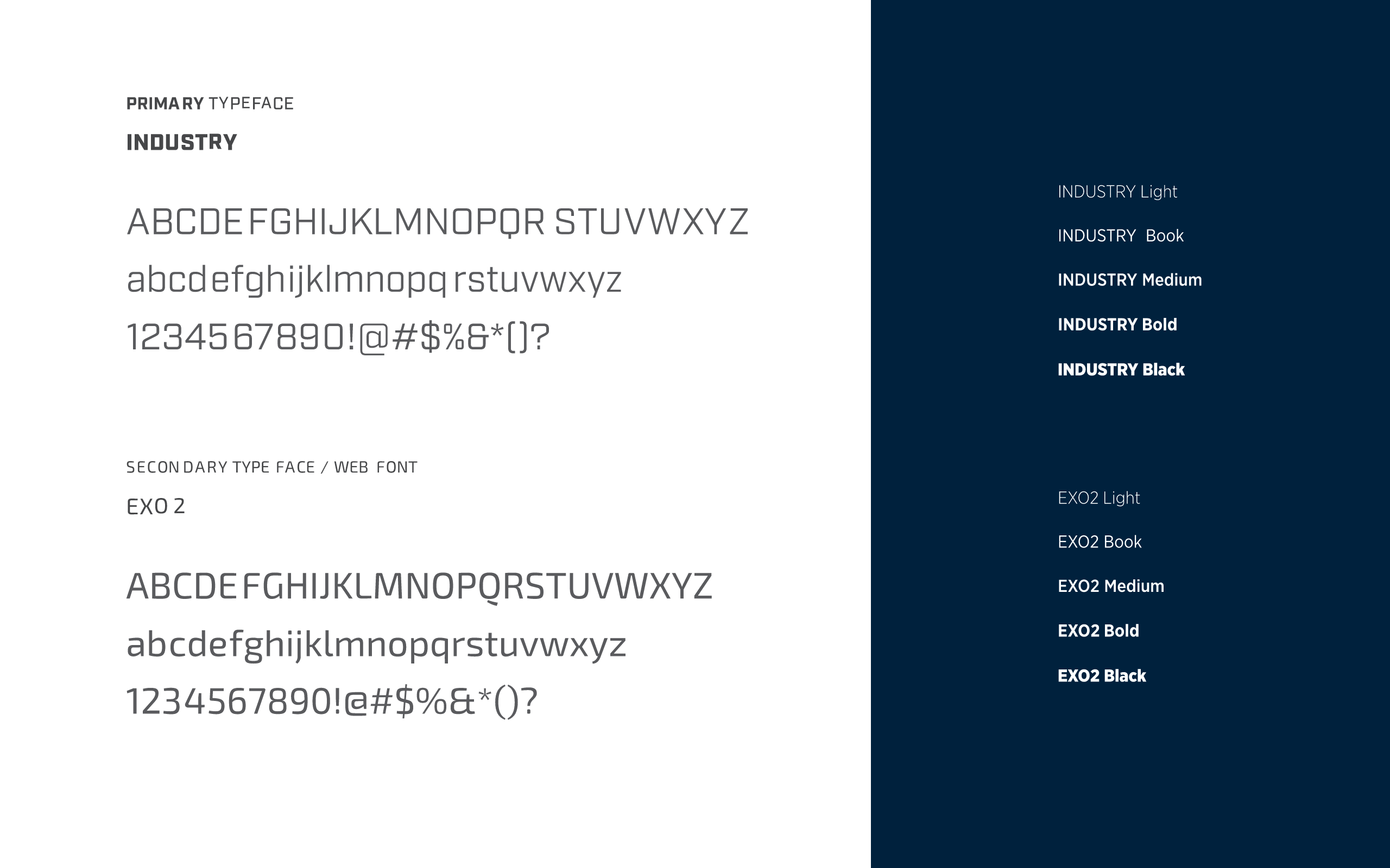
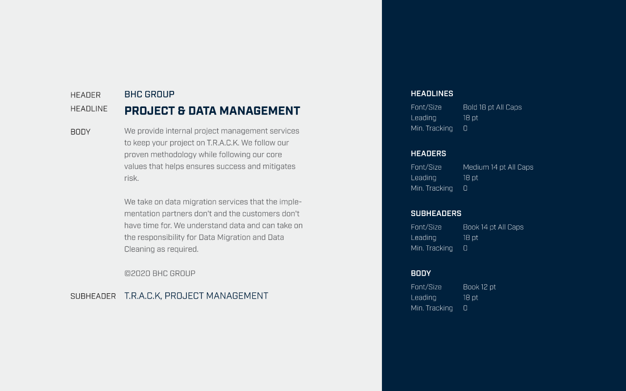
I have created a brand guideline for BHC, which is crucial for maintaining consistency in the use of the correct logo, colours, and fonts. Typography is also an essential aspect of the brand, and it should be used appropriately.


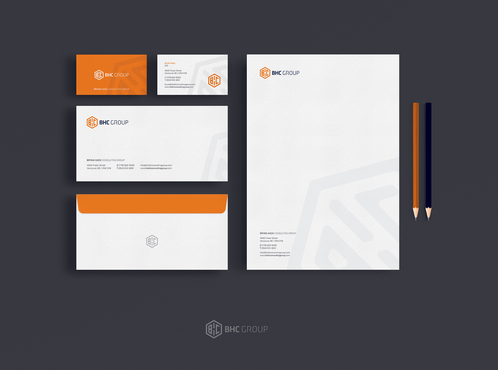
Therefore, all brand materials are available in PNG, JPG, EPS, AI, and PDF formats.

Mockups

Mockups are a useful tool for presenting a design in context. To help visualize their new logo and packaging before production, I created a few mockups. It allows client to see how their colour palette and design would look in real-life scenarios.