Visit Nootka embodies our unwavering commitment to crafting a destination that harmoniously merges thrilling adventure with a range of sensory experiences.
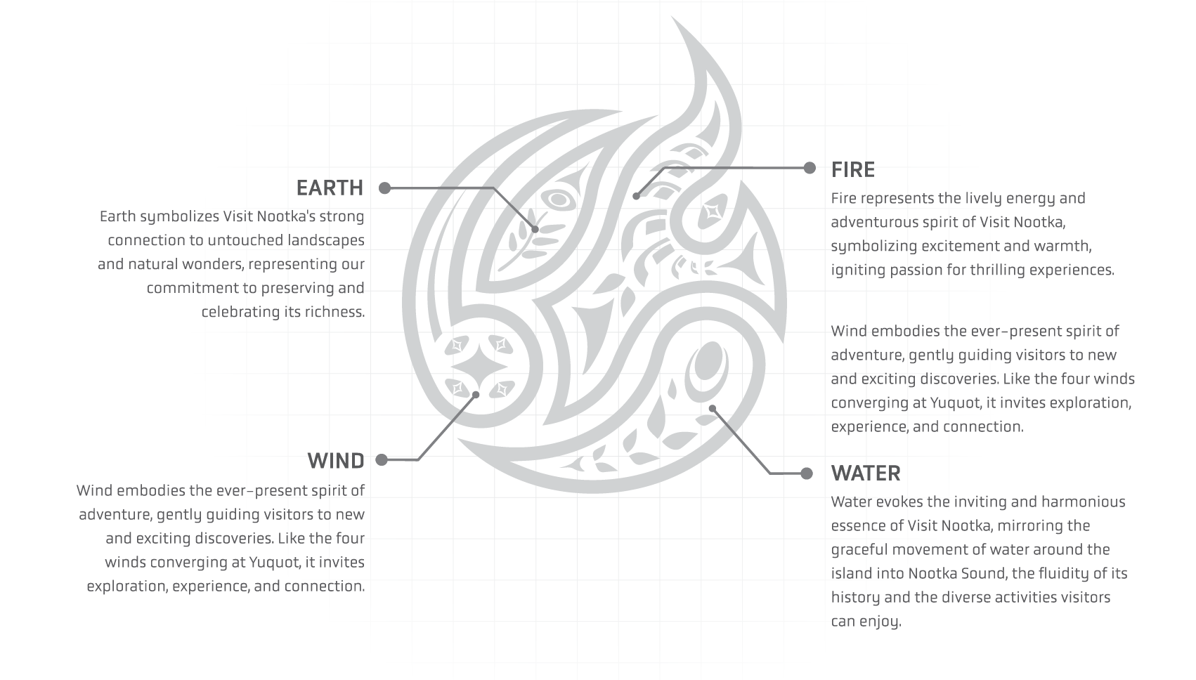
Our narrative is woven into the pristine landscapes of MMFN Territory, celebrated as a virgin playground, where the intersection of Earth, Air, Fire, and Water reflects the symbolic essence of a medicine wheel with 'Spirit' at its core.
The cultural significance of Yuquot, meaning "Where the four winds meet," emphasizes our dedication to sharing the deep history and diverse tapestry of Nootka.
As Friendly Cove historically symbolized unity among communities, it now serves as the gateway to many thrilling adventures and moments of pure joy.
Witnessing the water flow gracefully around the island into Nootka Sound, Visit Nootka transcends the conventional destination concept, evolving into a 'celebration' deeply rooted in nature, culture, and the boundless spirit of exploration.
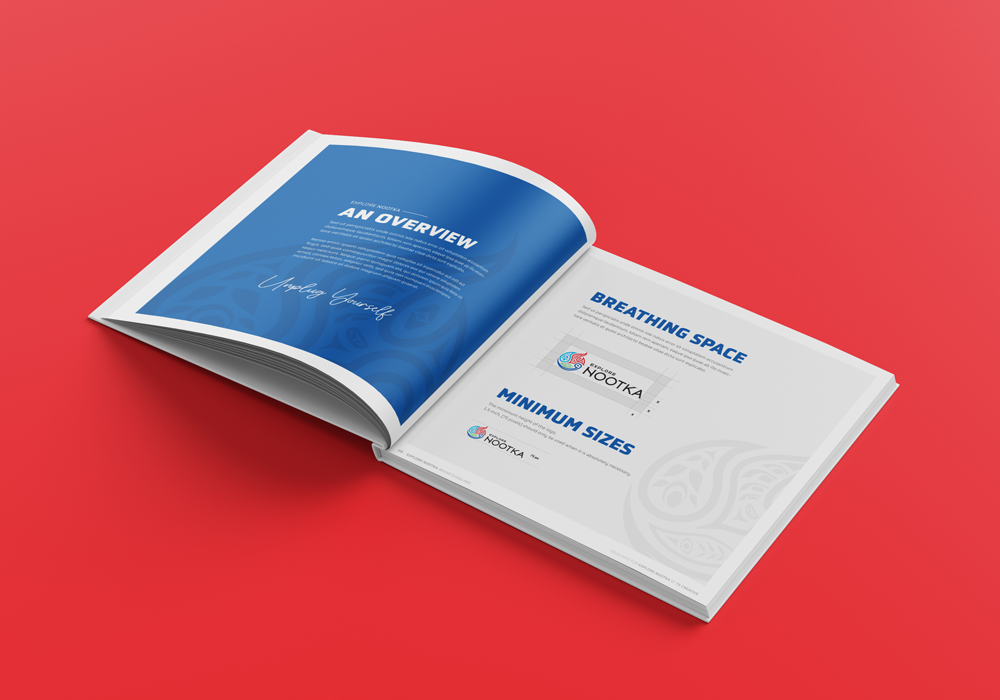
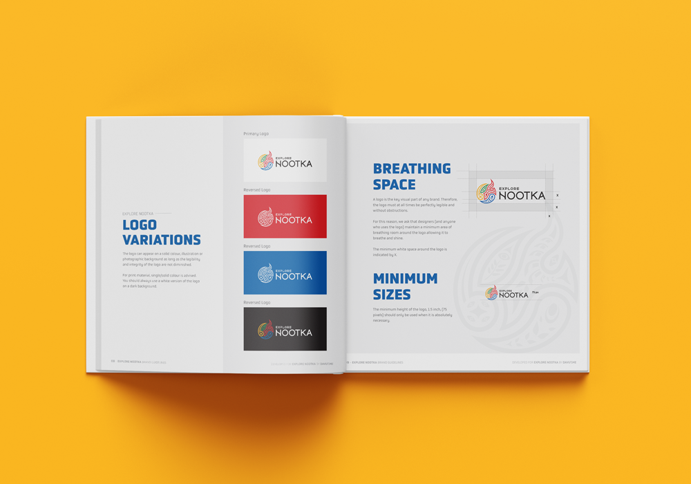
The primary and secondary colours should always be used with the designated colour values.
These colours are chosen in order to project the branding image of being a leading, dependable and quality company.
Typography
The primary and secondary colours should always be used with the designated colour values.
These colours are chosen in order to project the branding image of being a leading, dependable and quality company.
4 Elements
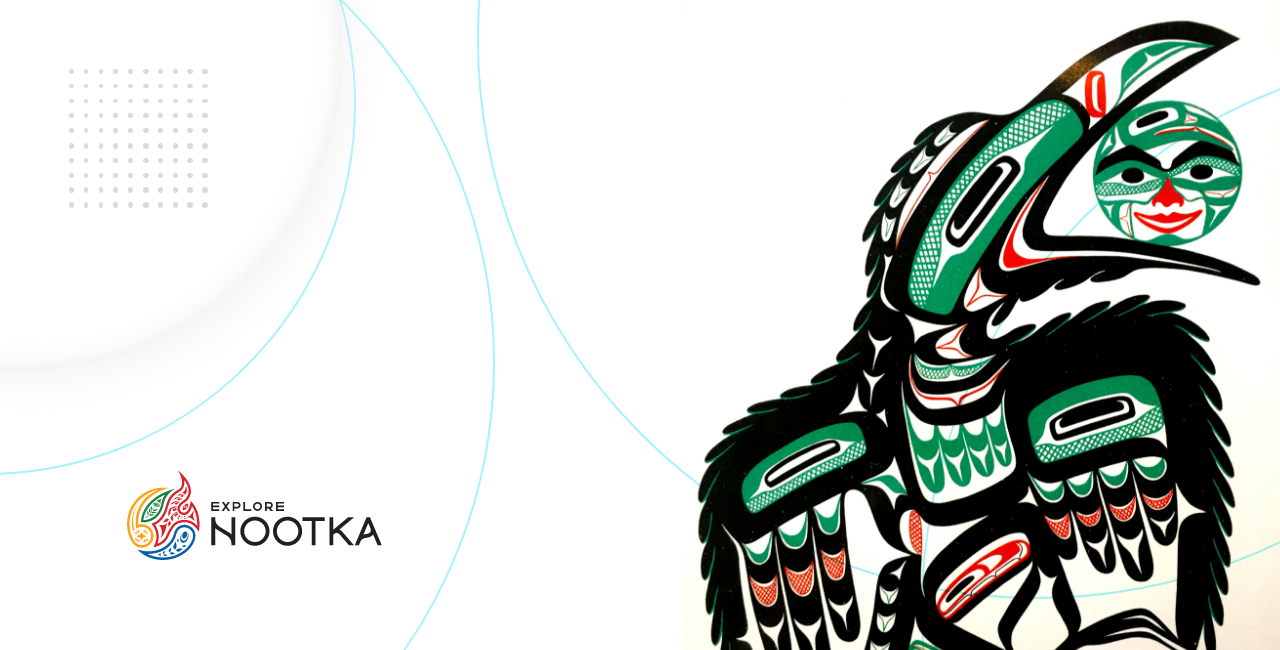
Brand Guidelines
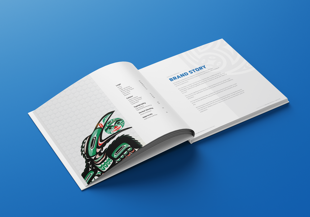
I have created a brand guideline for Nootka, which is crucial for maintaining consistency in the use of the correct logo, colours, and fonts. Typography is also an essential aspect of the brand, and it should be used appropriately.
Therefore, all brand materials are available in PNG, JPG, EPS, AI, and PDF formats.
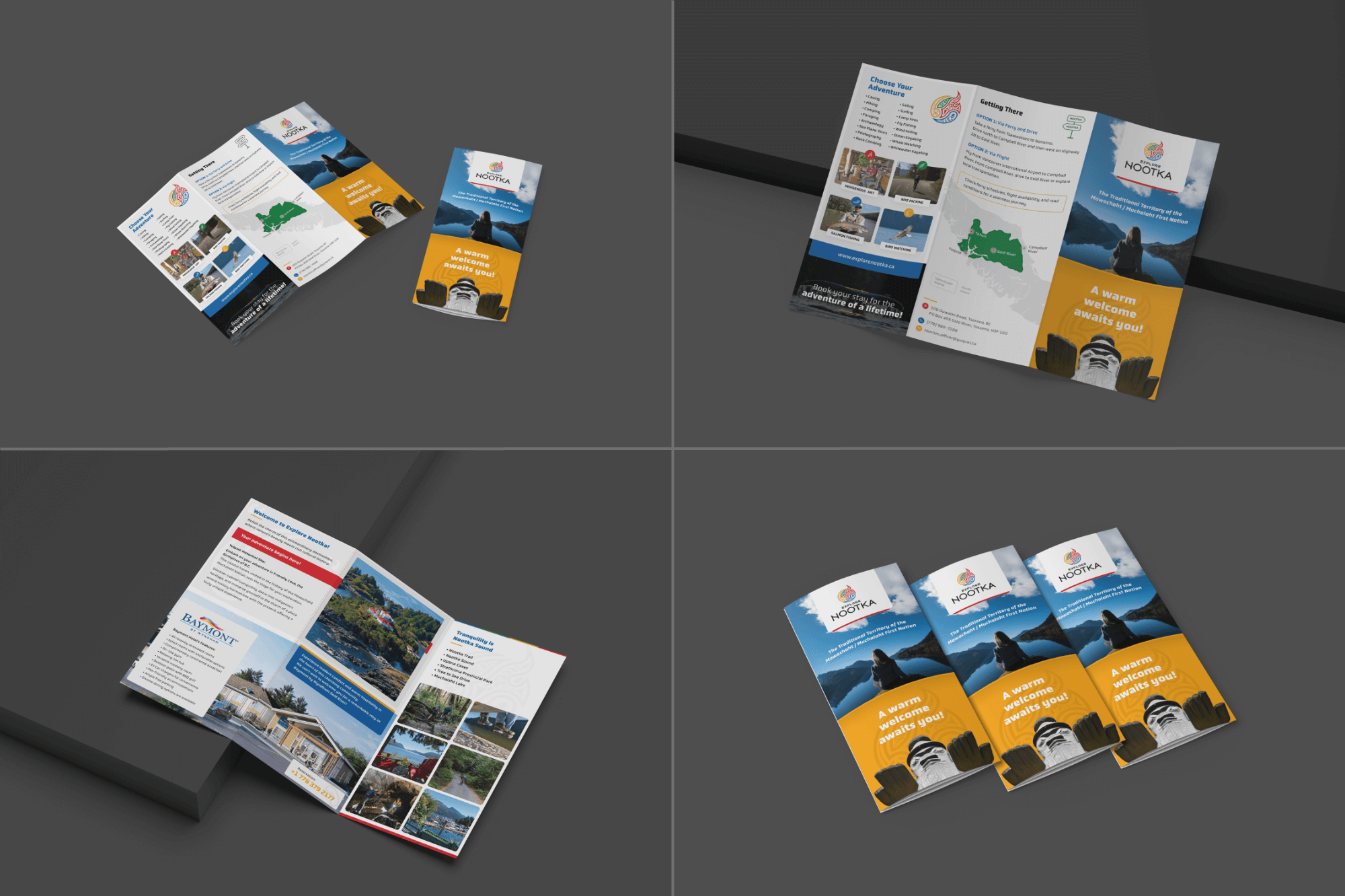
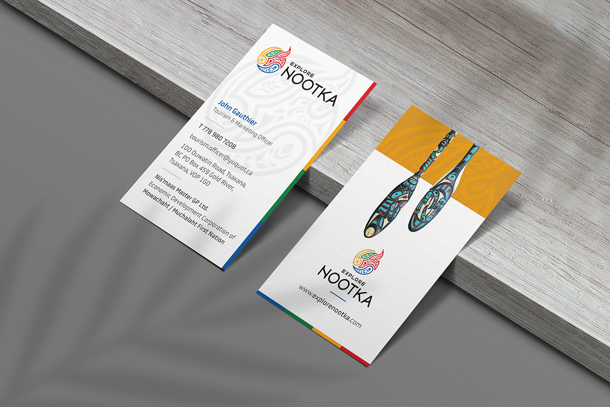
Mockups
Mockups are a useful tool for presenting a design in context. To help Nootka visualize their new logo and packaging before production, I created a few mockups. It allows Nootka to see how their colour palette and design would look in real-life scenarios.