Have you ever struggled to find the perfect spot for clubbing or events in Vancouver? I sure have!
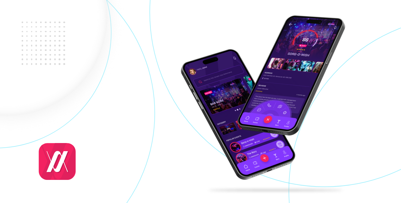
A companion for the night, the app allows people to discover the best party in town, broadcast their night to the public in real time, book events and guest lists, and meet like-minded people.
Transform the mobile app digital experience by focusing on dealing with user retention issues by improving navigation and optimization of features.
User Interview, Personas, User Flow, Hand Sketching, Figma, Adobe Illustrator.
Design Process
UX SEARCH
UX DESIGN
UI DESIGN
BRAND & STYLES
PROTOTYPE
Project Challenges
Difficulty in finding relevant and interesting bars and events in Vancouver.
Inability to track and manage events and bars in a centralized location.
Limited social features for sharing and discussing events with friends and other attendees.
Inconvenient ticket purchase process
Solution Statements
Simplify and enhance user's experience in discovering, planning, and booking bars and events.
Provide a user-friendly platform with diverse options to find bars and events matching their interests easily.
A comprehensive list of bars and events with various filters and search options.
Users can add bars and events to their wishlist and receive reminders before the event date.
Users can join bars and events comments to connect with other attendees.
Users can buy tickets directly from the app and get bar discounts.
User Interview
After exploring the problem space using secondary research, I conducted one-on-one interviews to collect qualitative data. This allowed me to enhance my understanding and empathy towards potential users.
In preparation for the interviews, I drafted a set of specific questions related to their perspectives on bar and event apps.
Question 1: What kind of information would be most helpful for you to plan or attend a bar or an event?
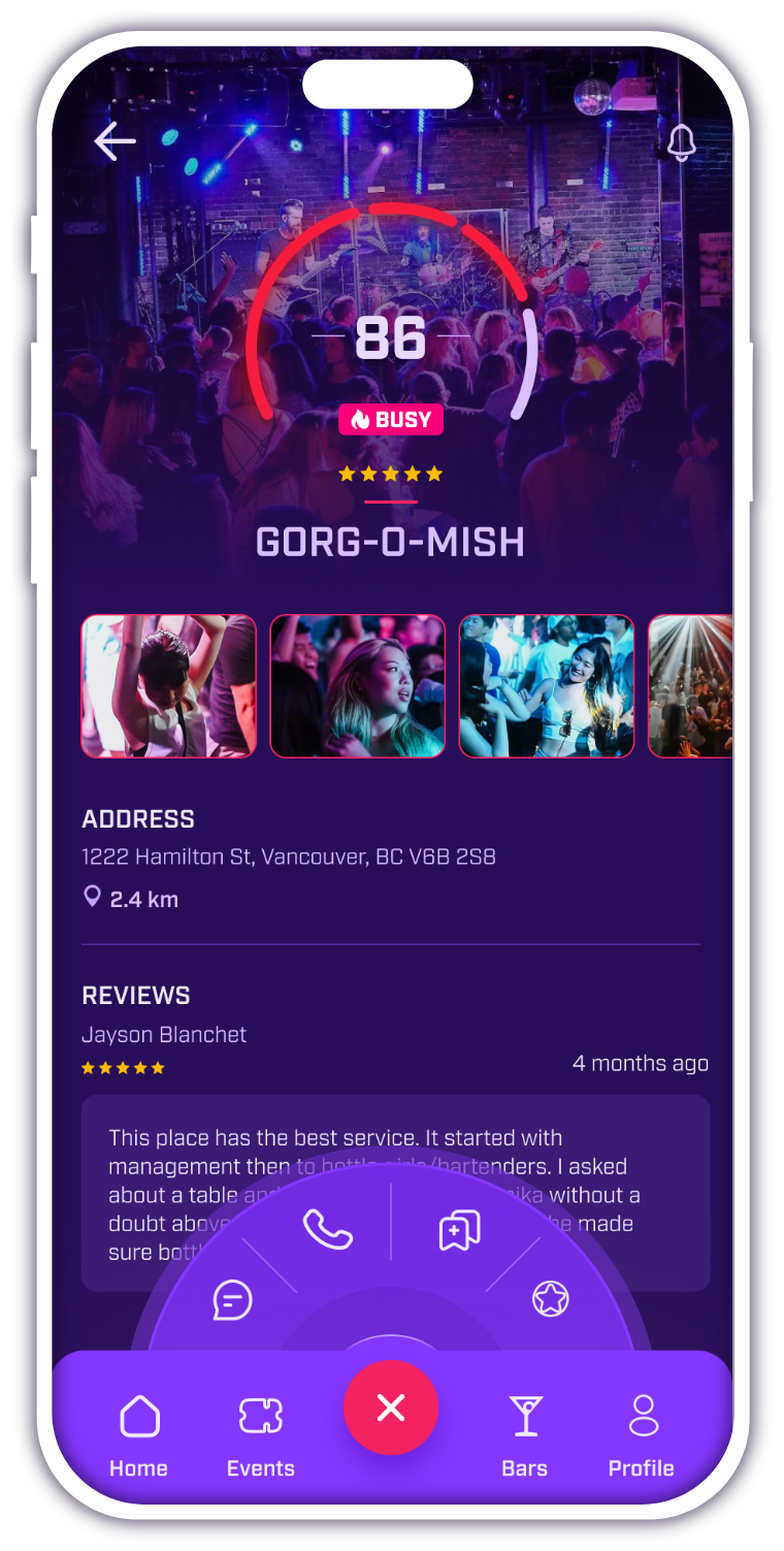
Insight: It would be helpful if I could view photos of the bars and the event space. This would allow me to better assess the ambiance and layout of the venue before deciding to participate.
Question 2: When searching for bars, what criteria are most important to you? For instance, do you prioritize proximity to your current location or do you have preferences for a specific geographic area?
Insight: Searching for bars and events near my current location is more convenient and allows me to discover interesting local activities.
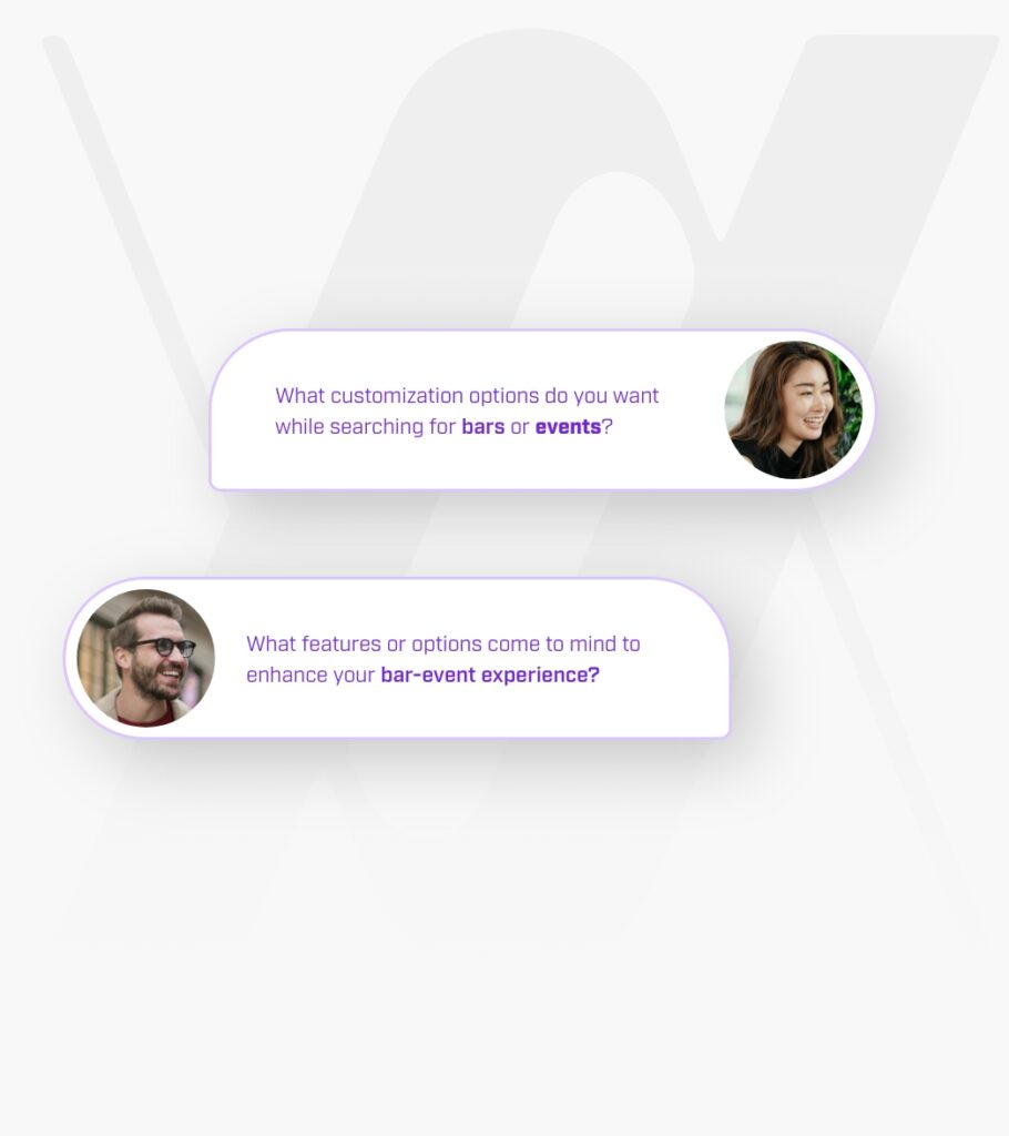
Question 3: What customization options do you want while searching for bars or events?
Insight: I want to filter my bar and event search by location, category, and cost to find options that match my preferences.
Question 4: What features or options come to mind to enhance your bar-event experience?
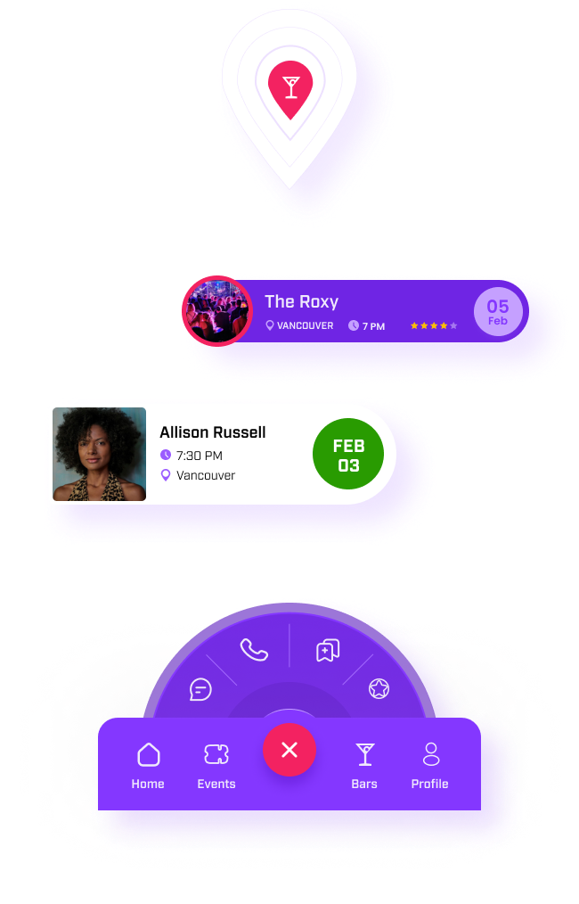
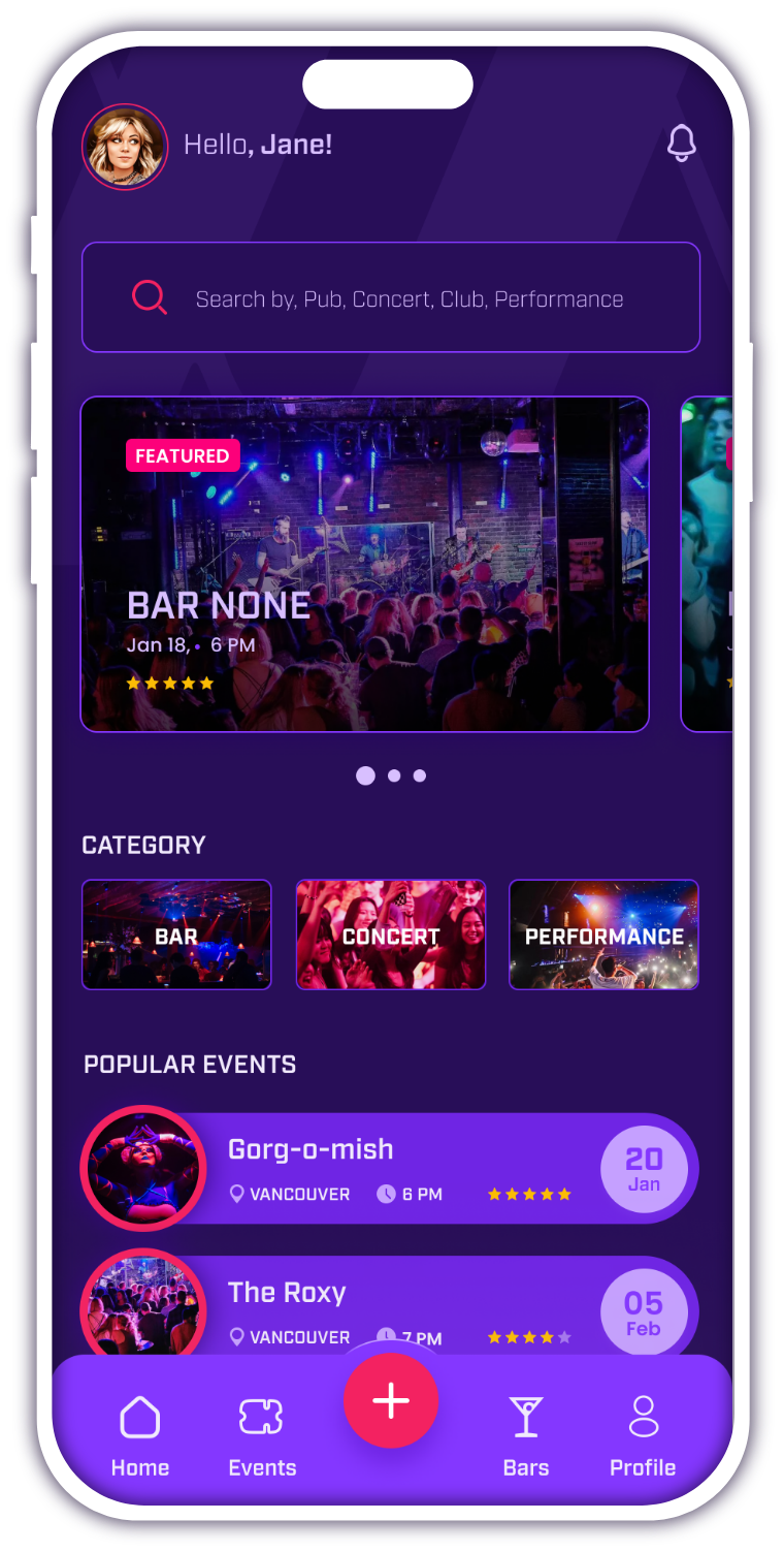
Insight: I created a magic button for easy navigation and short links in the magic menu.
User Persona
I conducted research to collect data on user demographics, preferences, and Frustrations. Using this data, I developed a user persona that represents the typical app user.
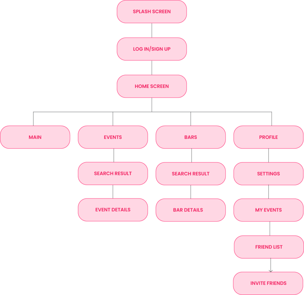
Information Architecture
To build an easy-to-use and clean system with a large amount of features and modules, we had to prioritize and structure the information. This allowed us to place pieces of information on every page in a meaningful way.
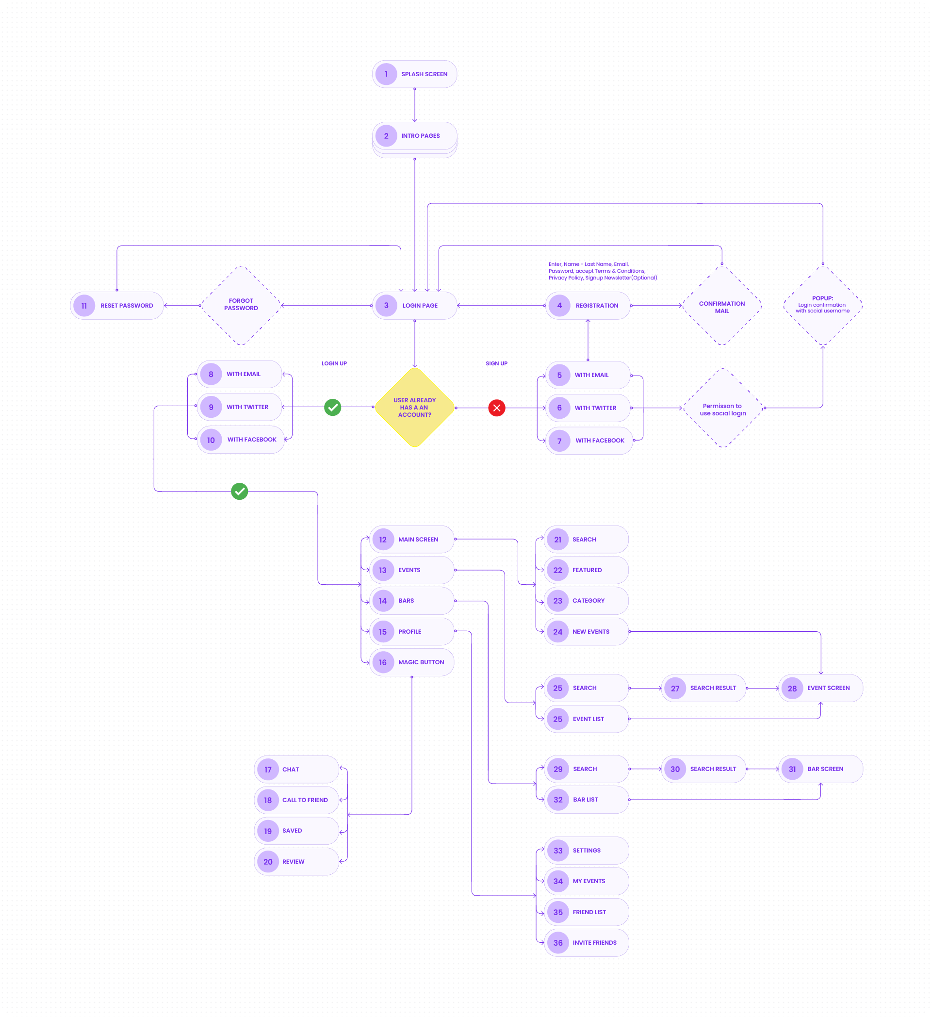
User Flow
During the user flow phase, I designed a comprehensive flow of the app's user journey from beginning to end. This involved mapping out the various steps that users would need to take in order to achieve their objectives, such as locating bars-events, signing up for events, and communicating with other attendees.
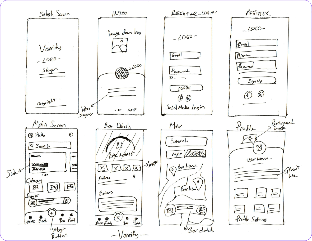
Sketches
Low-Fidelity Wireframes
After choosing the core task flow, I began sketching design solutions. This was followed by low-fidelity wireframes which were turned into a prototype to begin conducting user testing.
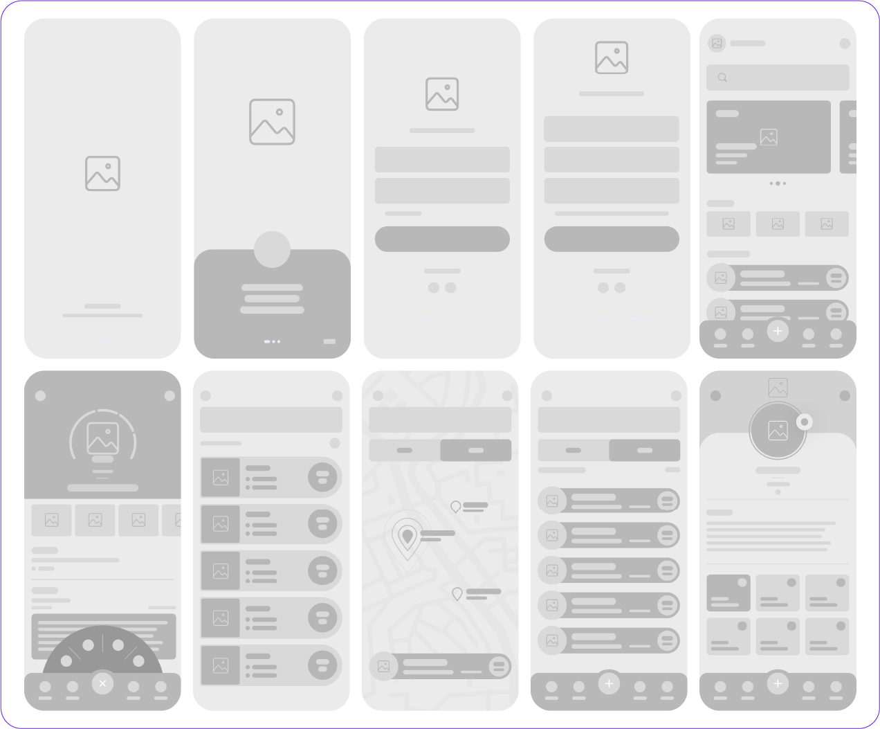
Hi-Fidelity Wireframes
Based on UX research, we have created a UI Kit that contains examples of all repeatable elements in the system. Its creation leveraged future additions of the new features and kept the overall system consistent and optimized.
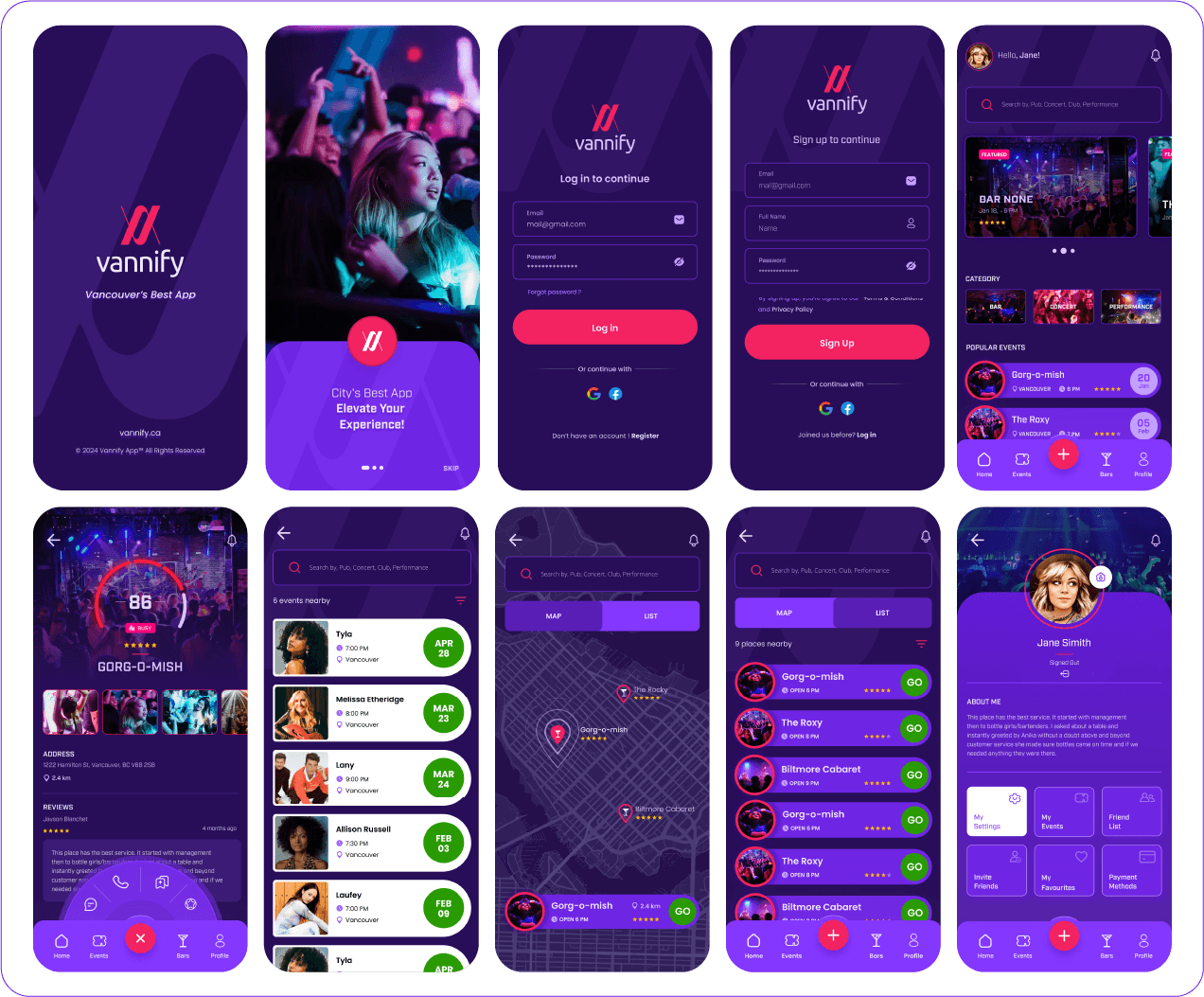
Brand & UI Styles
I have built the design language starting from the Main Page. After several iterations with the Users, I was able to find a key to a visual consistent interface that is very informative but easy to use.
Fonts
Colours
Icons
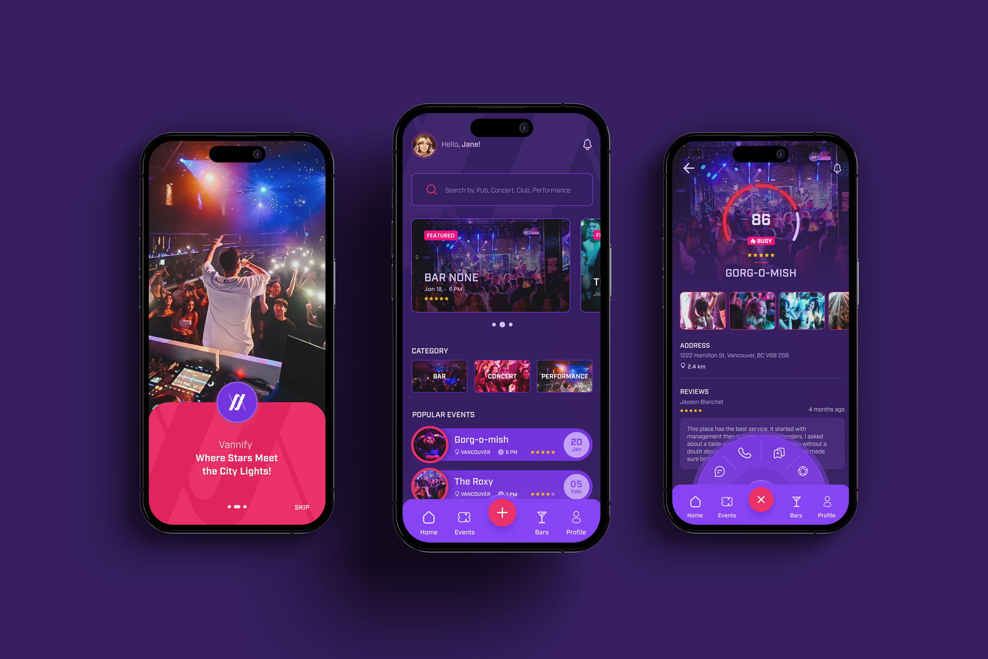
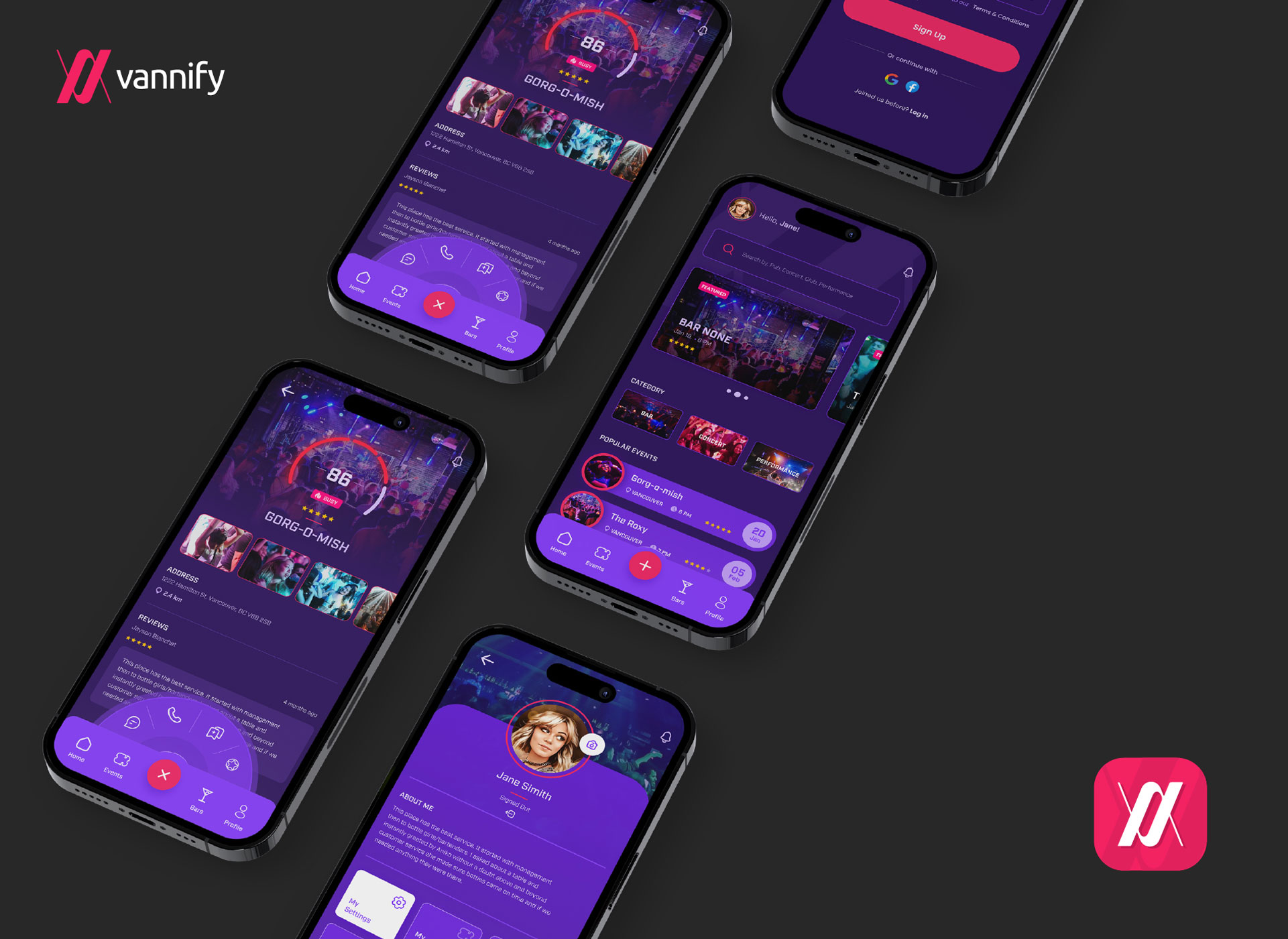
Prototype
I have built the design language starting from the Main Page. After several iterations with the Users, I was able to find a key to a visual consistent interface that is very informative but easy to use.
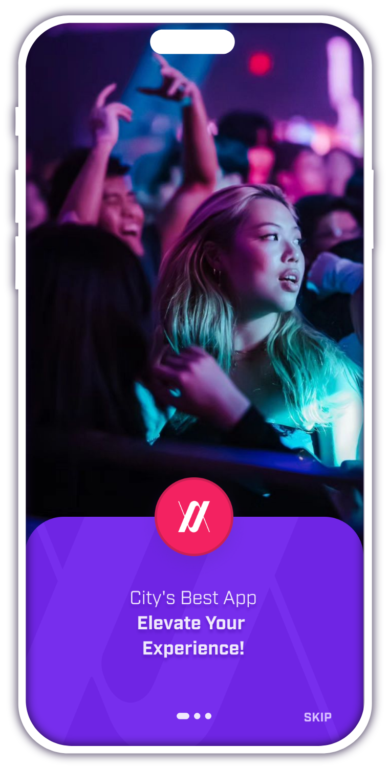
The design process for any new product is not linear and easy. However, if you're improving an existing product, much of the hard work has already been done. In this case, I simply need to focus on making it better based on feedback from users. This means looking at how people are currently using the product and making changes to improve their experience. It's all about making things easier and more enjoyable for the people who use it. By creating a new magic menu and saving space on the footer, I was able to streamline the design and improve the user experience. This enhancement not only saves valuable real estate on the page, but it also makes it easier for users to navigate and find what they need quickly.